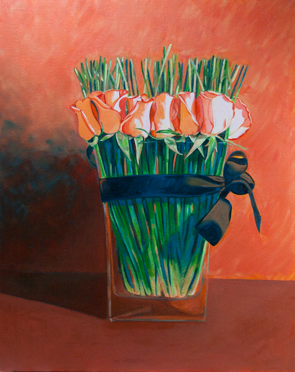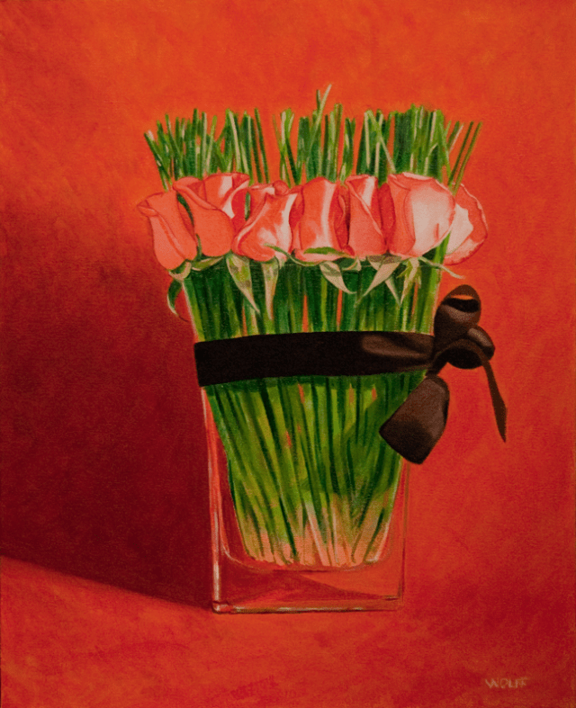
Yesterday I worked on the vase and the flowers. I noticed the vase was not accurate, particularly at the bottom, and I tried to address this. With the flowers, I tried adding values of hot pink.
Now it’s time to set aside for awhile and ponder later with fresh eyes. The picture below is the ‘before’ version. Compare to the revised version above and let me know if I improved it.


Absolutely improved
Fantastic Blog, Dwayne! I really like it and your skill in graphic design shows. As you know I like to help people “Create Great Art” and “Paint Better Pictures” and I have a suggestion about your ‘Safeway Bouquet’ – since the highlights are very bright on the tulip petals I think it would add a huge punch to the painting if you graded the background from very dark on the right to lighter on the left. Similar to what you have done with the cast shadow. Experiment with it and see what you think. – Ron
Hi Ron,
Thanks for looking. I’ve put ‘Safeway Bouquet’ aside for awhile, but your suggestion sounds worth pursuing.